Hover, Preview & Issue Detail
Hover preview
Hovering a pin on the canvas — or its card in the left panel — shows a floating preview near the pin: a photo, the issue number, status and type chips, the issue name, the due date, and the creator. The popup keeps a constant on-screen size at any zoom level and flips below the pin when the pin sits near the top edge.
Cross-highlighting
Hover works in both directions:
- Hovering a pin scales it up, highlights the matching card, and scrolls the card list to it.
- Hovering a card highlights it and scales up the matching pin.
The issue detail sidebar
Click any pin or card to open the issue's detail in a sidebar sliding over the canvas:
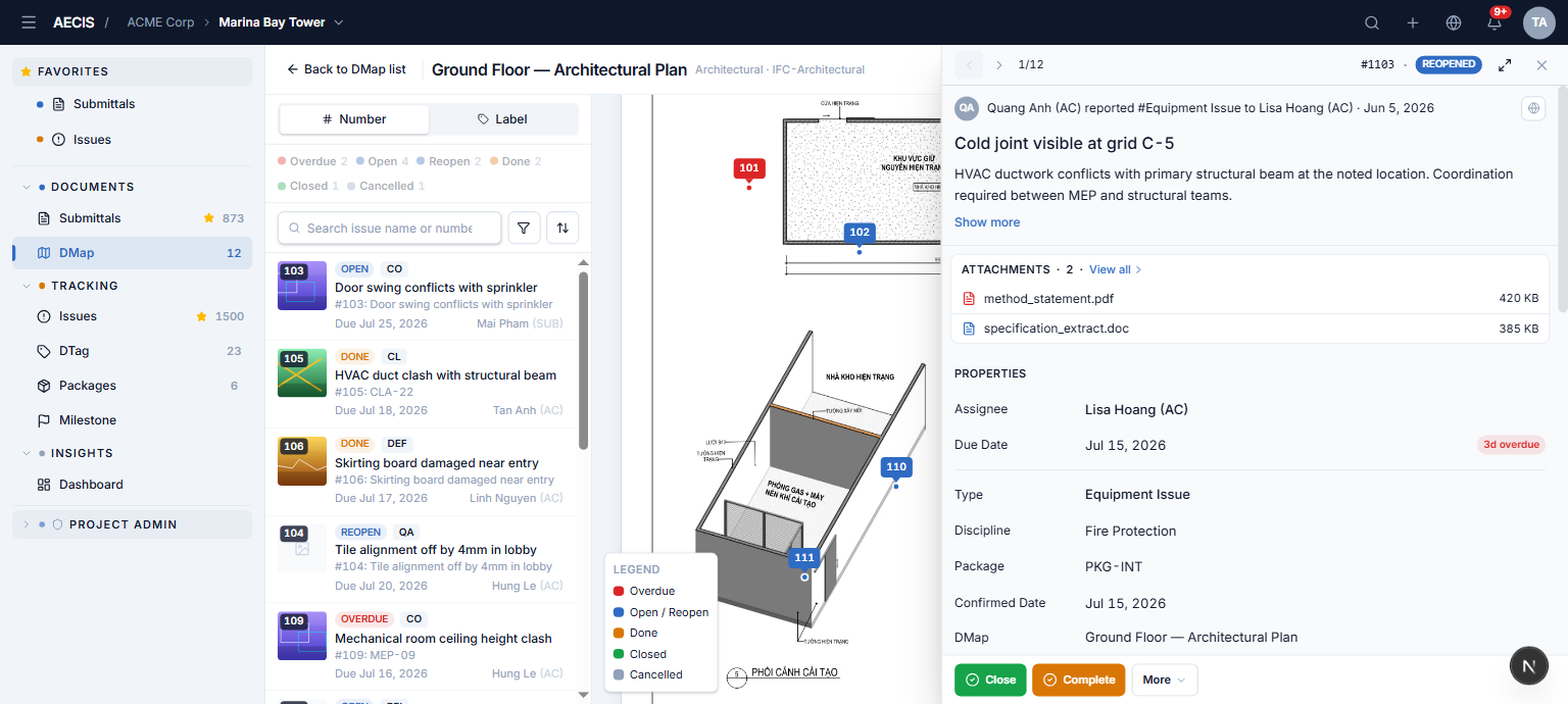
This is the same detail panel as the Issue module — the social card, properties, all tabs (Activity, Document, Distribution, DTag, Email, Related, History), and the action bar (Close, Complete, More…), so you can act on the issue right from the drawing.
- Prev / Next in the header steps through the currently visible (filtered) pins, with a position indicator (e.g.
1/12); the corresponding pin highlights as you navigate. - The expand icon toggles the sidebar to full width; press it again to return.
- Close by clicking the backdrop (in default width) or the × button.
- With the sidebar open you can still hover other pins for previews — clicking one switches the sidebar to that issue.